Measuring User Experience with Real User Data

Gone are the days when web performance was just a measure of how quickly a website loads. Speed will always be important, but metrics focused exclusively on loading times — like response time, time to first byte, and time to last byte — no longer say much about the quality of the user experience (UX).
In 2021, Google launched the Core Web Vitals (CWV) as part of the page experience update: a group of metrics that provides accurate UX information regarding speed, responsiveness, and visual stability. According to Google, CWV is the closest proxy we have for measuring UX quality — and it’s also significantly relevant to search engine optimization (SEO).
The core metrics included in CWV are:
Largest Contentful Paint (LCP): The time it takes for the largest content block to appear in the browser. That's when users can start reading or using the page. LCP should be no longer than 2.5 seconds.
First Input Delay (FID): The time between interaction with input fields, buttons, or other interactive components and their response to user input. During this delay, users may try to interact, but the application doesn't seem to respond. Pages should have an FID of 100 milliseconds or less.
Cumulative Layout Shift (CLS): The number of unexpected page content layout shifts — typically ads and third-party content, which may annoy users. Pages should maintain a CLS score of 0.1 or less.
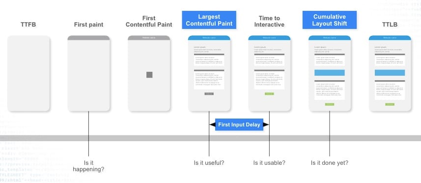
These metrics help application owners understand how users perceive the page loading (Figure 1). Can they start reading faster? Can they become engaged sooner? How quickly can they start to do whatever they came for?
Fig. 1: Example of the visual progress of a website
Focus on what matters most: user experience
There’s no denying the importance of UX. In fact, studies show a direct relationship between UX and business growth; customers are much more likely to re-engage with a brand if they’ve had satisfactory experiences in the past.
Today, digital transformation is an especially urgent priority for many companies. Since the COVID-19 pandemic, people have spent more time online: interacting, shopping, playing games, watching movies, and more. These modern users expect more from their online experiences than ever before, demanding instant responses and richer content.
Understanding what users need and value in their site or app interactions is key to any successful web performance strategy. When user demands are ignored, UX suffers, which could lead to user abandonment, brand damage, poor SEO rankings, and revenue loss. Focusing on UX is essential — and it all starts with measuring key metrics.
User experience measurement tools
To improve UX, you need accurate and impactful data that provides insight into users’ perceptions of the website or app in question. There are two ways to obtain this: synthetic tests and real user monitoring (RUM) tools.
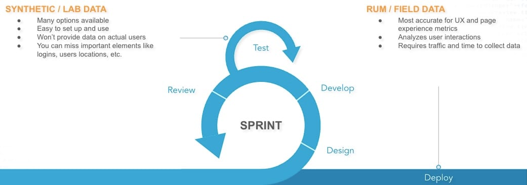
Both synthetic tests and RUM tools play vital roles at different points of the software development lifecycle (Figure 2). Synthetic tests (lab-based tools) are great for testing, debugging, diagnosing, and optimizing changes to production. Meanwhile, RUM measures performance using real user data and monitors changes that could impact future performance.
When measuring UX, RUM is the superior option because it can provide data points that synthetic tests can’t, analyzing user behavior and offering granular insight into devices, network conditions, and geographic locations.
Fig. 2: Performance measurement tools at different points of the software development lifecycle
With real user data comes great decision-making
If you’re already thinking about a strategy to improve site or app UX, real user data is your friend. UX decisions with a direct business impact should draw on real user behavior and outcomes.
Akamai mPulse is a RUM solution that enables companies to understand site experience from the users’ perspective. It measures all performance metrics, including CWV, and provides insight into a variety of important factors, such as internet speed, geographic location, and devices.
mPulse also helps identify performance optimization opportunities, points out elements that influence UX (such as images, scripts, fonts, or entire pages), and defines the relationship between performance and business metrics like views, conversions, and revenue.
Effortlessly identify performance opportunities
Akamai mPulse offers an updated user interface (now in beta) with a set of new, intuitive features that streamline the tasks needed to measure UX. The new interface helps improve performance and usability by prioritizing efficiency and agility when gathering vital data.
Build compelling dashboards
mPulse makes it much easier to create a custom dashboard that features compelling, easily readable data visualizations. The new drag-and-drop tool allows you to move any pre-configured or custom widget or section to another part of the dashboard. You can also make changes on the fly and apply selectors, filters, and dimensions at every level, easily comparing two or more sites within a single view.
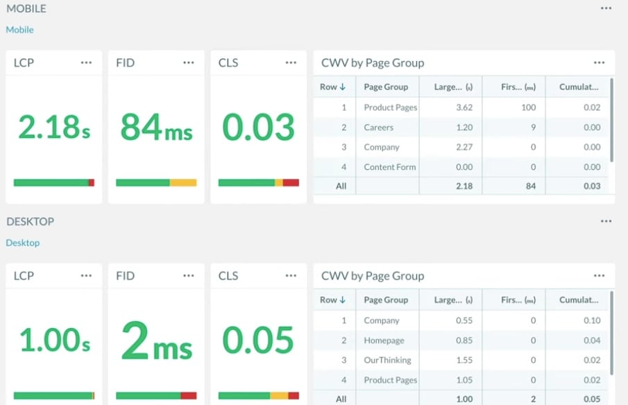
For more details about this feature, check out this video that demonstrates how fast and easy it is to create a custom dashboard that offers crucial insight into CWV by device type (Figure 3).
Fig. 3: Example of a dashboard comparing CWV by device type
Performance Explorer
Companies have become reliant on user-centric metrics, following Google’s best practices with the aim of achieving better SEO rankings. But what do you do after measuring UX?
Logically, you’d want to analyze all the available information and determine what might be affecting performance — but doing so is an extremely time-consuming process. Within our mPulse solution, Performance Explorer provides a curated view of industry-standard key performance indicators to identify which elements are directly influencing CWV scores. Performance Explorer can also act as a time-saving tool to help diagnose problems and facilitate informed decision-making.
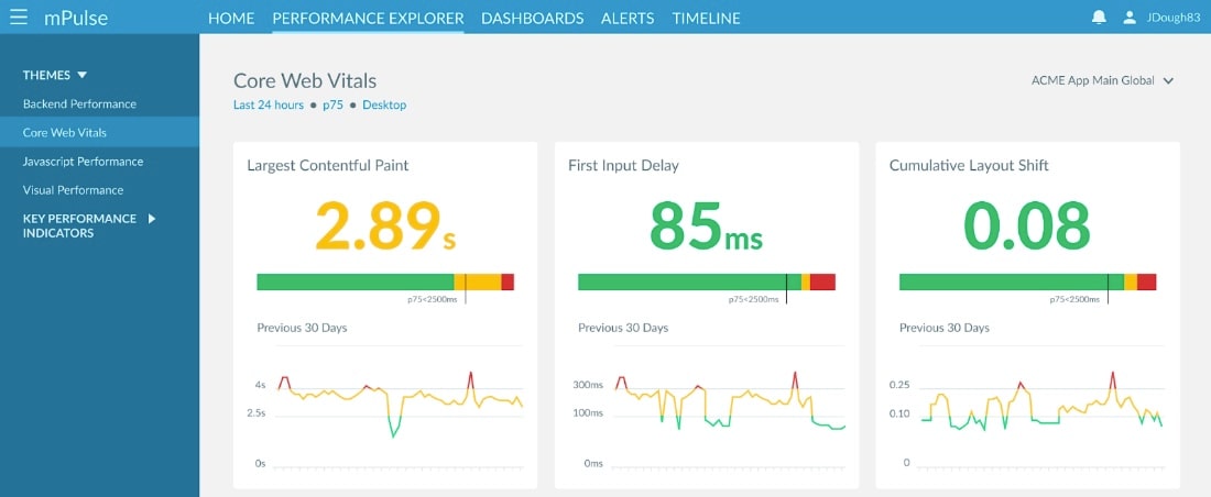
Figure 4 illustrates how the Largest Contentful Paint (LCP) can track the time it takes for the largest visual element on the page to load for a user. In this example, it takes almost 3 seconds to load, increasing the likelihood that users will abandon the site and choose a competitor.
Fig. 4: Example of the performance explorer CVW view
Figure 4 shows us that the LCP isn’t optimal, but we have no visibility into which elements affect the metric score. Performance Explorer allows us to drill down into a given metric, such as the LCP, providing indicators relative to that exact metric. The leading indicators feature highlights specific areas you should focus on to improve this metric (Figure 5).
Fig. 5: Example of the leading indicators
Figure 5 identifies three elements as impacting the LCP metric. Clearly the size of the image file is a critical factor, and reducing image bytes could help improve LCP. The First Contentful Paint (FCP) often comes as a text or background image, and the Back-End Time (otherwise known as time to first byte, or TTFB) could potentially improve with code optimization, caching, and pushing JavaScript and CSS resources faster.
The Relative Timers offer another effective tool. This widget not only offers a quick way of navigating through each timer, but also helps identify where the metric is loading within the page load and shows the time each metric took to complete, providing a broader picture of how users perceive the overall site experience (Figure 6).
Fig. 6: Example of the relative timers
UX monitoring tools and best practices
There are plenty of tools that can help you measure a website or app’s UX. When using these tools, be sure to keep these best practices in mind:
Make business decisions based on real user data. Akamai mPulse provides in-depth visibility into user behavior and helps you identify web performance problems.
Monitor your site’s performance over time. Some site updates can negatively impact UX, so it’s important to catch them as quickly as possible.
Use synthetic testing to stay ahead. These tests can help with identifying web performance issues, debugging, and diagnosing site changes.
Learn more
If you’re curious about how Akamai mPulse can help enhance UX, contact our support team or try mPulse yourself with our free trial.


