Measuring and Improving Core Web Vitals

Google recently announced a proposed update to its search ranking algorithm: the Page Experience Update. This change, which launches in 2021, includes more performance signals in the ranking algorithm. A subtle but important feature of the update is that Accelerated Mobile Pages (AMP) will no longer be a requirement for promotion to Top Stories -- fast pages are all you need!
In this post, we will discuss the three new metrics that will serve as performance signals as well as what goals to set, how to measure them, and how to improve them. We will use freely available tools such as WebPageTest.org and Google Lighthouse, as well as Akamai mPulse, but the overall recommendations are tool agnostic.
The Page Experience Update means performance matters more than ever to search engine optimization (SEO). Akamai's mPulse now supports the new Core Web Vitals metrics right out of the box and provides actionable insights for you to get ahead of the curve. In addition, our Adaptive Acceleration suite helps to improve Core Web Vitals -- so make sure you are making the most of it!
Measuring user experience
The three new metrics have been selected by Google from a slew of available measurements. The criteria for selecting these is presumably threefold:
Measurable both in the field (e.g., Google Analytics, Chrome Real User Experience report) and in the lab (e.g., Lighthouse, Pagespeed Insights)
Represents quality of perceived user experience
General enough to report valid results across all webpages
The experience of a page load can be broken down into four stages:
Is it happening? (Time to First Byte)
Is it useful? (Largest Contentful Paint)
Is it usable? (First Input Delay)
Is it delightful? (Cumulative Layout Shift)
The metrics were selected to give good coverage over these stages, without overwhelming organizations with a large number of new metrics (and three letter acronyms). Traditional page speed measures like Page Load and DOM Ready are good for general cases but often fail to report on user experience for single page applications. The shift from traditional browser APIs (such as the venerable Navigation Timing API) allows Google to move more quickly than the standards track and find metrics that more closely match what a user perceives as performance.
The three new metrics are Largest Contentful Paint (LCP), First Input Delay (FID), and Cumulative Layout Shift (CLS). Let's look at each in a little more detail:
Largest contentful paint (LCP)
LCP measures when the largest element (in visible pixels) was painted to the screen. This can be a hero image, a video, an element with a background image, or a text block. The logic is that the page will appear useful once the largest element is visible, and all HTML, Cascading Style Sheets (CSS), and JavaScript required to render the page has been downloaded, parsed, and processed.
Taking the akamai.com home page as an example, this Chrome performance timeline shows the difference between First Paint (FP) and LCP. Here the background image loads a few milliseconds after the hero element is painted, this is reflected in the LCP measure:

First input delay (FID)
FID measures the delay between a user's first interaction with the page and the next time the main thread was available to respond to the event. This is a reasonably hard concept to grasp technically, but the general idea is that the browser cannot respond to a user-initiated event until other activities have stopped. Measuring the difference between when the user tries to interact and when the browser can respond is a proxy for how "nice" the experience feels.
This diagram from Google's documentation shows how FID would be calculated in a synthetic scenario when a user input is received at the beginning of a long task:

FID is a tricky metric, as it requires a user to interact with a page for the metric to be captured. Only discrete interactions like clicks or taps are included, further reducing the number of page loads that will generate the metric. Since it requires user interaction, FID can only be collected from the field: real user monitoring (RUM). Google proposes using Total Blocking Time (TBT) as a proxy for FID in lab tests; TBT can also be collected from the field. TBT is the sum of long tasks during the page load and lower is always better!
Cumulative layout shift (CLS)
CLS introduces the most novelty in performance measurement, and thus the most confusion! CLS is a cumulative score, calculated throughout the page load, of all unexpected layout shifts (i.e., those not triggered by a user interaction). This measure is a proxy for how stable the page load experience feels to a user.
Layout shift scores are calculated as the product of how much of the viewport changed and how far the biggest change was. This is easy to see below, where a custom web font causes the layout to shift. This creates a layout shift score of 0.5:

Setting core web vitals goals
Google has helpfully given us goals for the three new metrics:

The color-coded scoring shows us where improvement is required, and where our pages are delivering great experiences. It's fair to assume that improving an already "green" result will not improve ranking signals, but is still a worthy goal for improving user experience.
The LCP goal is close to our familiar golden rule of three seconds. User experiences that take longer than three seconds are known to feel slow, so the LCP target is that 75% of users achieve an LCP of 2.5 seconds or faster.
The FID goal is 100 milliseconds. Interactions faster than this will feel instantaneous, so ensuring that 75% of users achieve this goal is a good measure of how interactive your pages feel.
The CLS goal of 0.1 allows for some shifting as the page loads, but no more than a small cookie banner or advertisement slot. Any more than this and users are likely to be frustrated as content moves around.
Measuring your vitals
Google and Akamai provide a few methods to determine your Core Web Vitals scores from lab data and field data.
Lab data vs field data
Lab data provides the most simple method to get web vital metrics, taking a few seconds and no code changes. The trade-off with lab testing is that the data is only relevant for the machine that performed the test, at the time it was run, and does not necessarily represent what users experience. The advantage, though, is that test runs are reasonably consistent so they are a good measure of results in pre-production environments.
Field data collects performance metrics from real visits to your pages. There are two main sources of this data: Chrome User Experience Report, which collects performance data anonymously from Chrome browsers, and the Akamai mPulse RUM solution, which collects performance data from users on every browser who visit your website. Field data provides a better view of how real users experience your site, but the results are not as clear-cut as lab data and may require some interpretation.
Google's Page Experience Update will most likely use Chrome User Experience Report data at the 75th percentile.
PageSpeed insights
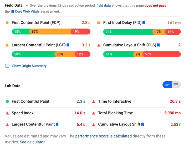
Google's PSI tool combines lab and field data in one audit report, providing an at-a-glance view of performance against the key measures:

The first section is the field data collected from the Chrome User Experience Report on the URL you tested. You can view the field data for your whole domain if you select “Show Origin Summary”.
The second section is your lab data, tested from a Google server in the U.S. As stated, the results will vary, but these are the values used to calculate the prevalent Page Speed Score for this test run. The valuable data here is the recommendations for opportunities to improve performance, based on static analysis of the page.
Performance data is collected for both mobile and desktop, but there is no ability to drill further into the data, such as by geography, device manufacturer, referrer, browser, and more.
Akamai mPulse RUM
mPulse RUM is a small JavaScript library that turns every page visit into a performance data point. This data is stored in full and aggregated when you run a report or build a dashboard. As of September 2020, mPulse supports the three Core Web Vitals as well as all the navigation, resource, server, and user timing APIs.
The advantage of collecting Core Web Vitals in a RUM solution is simple: actionable data. RUM solutions provide deep-dive analysis to allow product, engineering, and operations teams to identify which user or site segments have poor results. Knowing that a page is performing poorly is only one step in the performance journey -- RUM data tells you who has a poor experience, on what ISP, and at what stage in the user journey.

mPulse supports a wide range of performance metrics and we are always working to capture the most relevant and actionable data. The results you get in mPulse will not be exactly the same as with other tools, such as PageSpeed Insights. This is due to a number of factors such as the customer-configurable delay before sending a beacon, slight differences in calculations, and the use of a broader data set. Google will only collect a sample of data from Chrome browsers with users opted-in to anonymous analytics, while mPulse collects 100% of valid page views. This makes mPulse data more actionable, just be aware that the numbers will not match Google results exactly.
WebPageTest
WebPageTest provides a simple user interface to run a lab test against any public URL. As of early 2020, the results page includes a summary of the Web Vitals results for the page; the colors are based on Google's recommendations.

The ever-useful filmstrip view in WebPageTest now also highlights, with a dashed yellow border, when layout shifts are detected. This is to aid identifying the offending element (in this case, the social widget sidebar):

It is important to note that these data points are only available when testing from a Chrome browser.
Improving core web vitals
Understanding Core Web Vitals is the first step, improving them is the second! These new metrics have been designed to proxy the user experience on your pages, so it will always be a good idea to improve them to provide a better experience. Now we have an additional driver for investment in performance as these metrics will become SEO ranking signals in the near future.
If you find that your Core Web Vitals are not always in the green, you'll want to work out why and how to improve them. Each will require a slightly different process and potentially different teams, so we'll look at each in turn. I've used akamai.com as an example here, with performance tests artificially throttled (slowed down) to make the observations more clear.
Optimizing LCP
This new metric is the closest to our traditional performance measures, so optimizing it should be quite familiar. If we take a look at a waterfall chart with the LCP overlaid (red vertical line), we see that anything that occurs before the event is in scope for optimization.
If this is your first time reading a waterfall chart, you might like to read this blog post first.

The waterfall shows that there are two blocking scripts preventing the browser from loading the images immediately, including one from a cross-origin domain. This results in a slight delay in rendering that could be improved by making the scripts asynchronous. Otherwise, the LCP metric occurs shortly after the hero image (request #4 in the waterfall) is downloaded. This image is already optimized by Image & Video Manager so there is no further work to be done here.
When looking to optimize LCP, focus on the critical path to rendering your hero element. For product pages, this will likely be your primary product image and for search results, it will be the element containing the results. Reducing Time to First Byte, decreasing CSS size, and blocking JavaScript will always help improve LCP. It might also be wise to defer loading of noncritical assets, such as below-the-fold images, as this affords more of the available bandwidth to the assets that matter most to your visitors (and the LCP metric).
Akamai's Adaptive Acceleration features will all help improve LCP: preloading fonts, pushing critical resources, and using next-gen compression algorithms combine to maximize the work done in the critical first milliseconds of page load. Optimizing your Time to First Byte by enabling HTML caching at the edge or using SureRoute will also have a direct benefit on the LCP metric.
Improving FID
FID is a difficult metric to optimize as we cannot control the user's interactions, so we tend to focus on total blocking time (TBT) as a proxy. TBT will always be higher than FID, but optimizing it reduces the likelihood of a user experiencing a long delay and thus should reduce field-measured FID.
TBT is generally measured as the duration of the page load when the browser's main thread was busy, calculated as the sum of long tasks. In WebPageTest, this is indicated as red sections in the Page is Interactive graph:

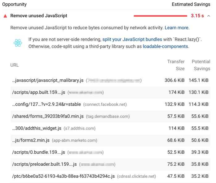
Main thread work is normally caused by client-side JavaScript. Improving TBT is often a time-consuming task as it requires finding and removing unnecessary code, event listeners, and third-party libraries as well as reducing bundle size and deferring execution.
Modern JavaScript frameworks are often isomorphic and support server-side rendering to reduce client-side CPU requirements. This could be a quick way to reduce TBT, but rehydration will still consume CPU resources and may actually result in an even greater FID, so test every change!
Google's PSI will give some hints on where the biggest areas of optimization might be:

Reducing CLS
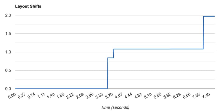
Layout shifts occur when the browser needs to change layout based on new content (or JavaScript changing the DOM). This can be a complex topic that warrants its own blog post. In short, look for when the layout shifts occur in a WebPageTest filmstrip and identify your offending elements. A useful chart is the Layout Shifts graph, showing how the shifts accumulate to the total score. Look for big jumps and zero in on the filmstrip at this timestamp:

Looking at the filmstrip image shows that the first big step is due to the social media icons loading and throwing off the scroll position of the hero image, which resets in the next frame:

This may be as simple as a line of CSS to prevent the hero image from moving or reconsidering how the social icons are loaded on the page. Here are some other simple fixes to reduce layout shifts:
Include dimensions in <img> elements
Pre-allocate space for lazy- or slow-loading elements
Ensure your web and fallback fonts have the same line height, or use “font-display:optional”
Be ready for the page experience update
In this post, we introduced three new performance metrics that proxy user experience. These metrics serve as useful indicators of how fast a page feels to users, quick it is to respond, and stable the layout appears.
In 2021, Google will use these metrics as ranking signals, with clear goals set out for what good metrics look like. Understanding, measuring, and optimizing for these new performance metrics now will help you benefit from the Page Experience update, rather than being penalized!
There will be more opportunities to engage with us on this and more at Edge Live | Adapt. Sign up to see how customers are leveraging these improvements, engage in technical deep dives, and hear from our executives how Akamai is evolving for the future.


